

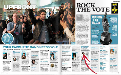
I looked at NME magazine because it is one of the most well known music magazines in Britain and it is a similar genre magazone to mine so I was able to look at what stories they cover and how they present and layout their double page spreads, so it will help me consider ways of laying out mine. These images are two double page spreads from NME magazine, I like the continued collour scheme of blue and white throughout the text and imagery, also I like the way they box out diffrent articles from the main text. They are both similar as they both have a main larger image and then partition of the writing, they also have other little extra images on the page to fill up space and make it look more interesting, so I will have to take more images to put on my double page to make it look more presentable and eye stimulating. Also on these double page spreads they have separate columns which have different articles in them so I may think about doing one of them to make it look professional as well as covering more stories to entertain.
No comments:
Post a Comment