
Thursday, 24 January 2013
Magazine Research
Here are the questions I asked and the answers I recieved from the interviews I did with a few people who fit in to my target audience. I have interviewed a number of people who fit in my identified target audience and have questioned them of what articles and stories they like to see in the music magazines they read. This will inspire and influence the decisions I will make when it will come to making my magazine and to create a good product suitable for my target audience and will attract them.
Me: What do you look for when you look/buy a music magazine?
Mark: I look for intresting articles and interveiws about bands and artist like, I also like it
if there is a chance to win something, such as a festival ticket.
Me: What is your favourite genre of music?
Mark: I mostly like eveything, however if i were to choose a particular genre I would choose Indie Folk such as momford and sons.
Me: What colour theme would you like to see on a magazine?
Mark: Red, Blue and Black as they are both suitable for boys and girls.
Me: What do you prefer images or text?
Mark: obvously I like looking at images, however I prefer to read more as get to find out
information and facts about music, bands and charts etc.
Me: What do you look for when you look/buy a music magazine?
Jordyn: I like seeing articles about artist's I like also its a bounus if there are posters inside.
Me: What is your favourite genre of music?
Jordyn: I would say everything from Florence and the Machine to Fall Out Boy.
Me: What colour theme would you like to see on a magazine?
Jordyn: Colours that don't direct at any specific gender such as reds, white and blacks.
Me: What do you prefer images or text?
Jordyn: I prefer to look at images, as I like to see what people are wearing.
Me: What do you look for when you look/buy a music magazine?
Elliot: I like seeing dates for loads of gigs and events, as well as updates of new bands around.
Me: What is your favourite genre of music?
Elliot: Im in to indie rick bands such as the killers, there my favourite.
Me: What colour theme would you like to see on a magazine?
Elliot: Red,black and white, because they are eye catching and simple.
Me: What do you prefer images or text?
Elliot: I like images, however I do like a fair amount of text to read as well.
From my interveiws and answers I have received, I have come to a decision that my colour scheme will involve black,red, blue and white as they are colours which relate to both males and females. Also that I will have images to look at as well as a fair a mount of text to read, and a coverline that says 'Win a ticket for......festival'. I will also definatley include information on bands and artist, like the killers and momford and sons.

Monday, 7 January 2013
Contents Page Inspiration


Double Page Inspiration

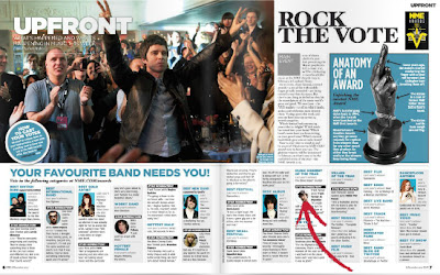
I looked at NME magazine because it is one of the most well known music magazines in Britain and it is a similar genre magazone to mine so I was able to look at what stories they cover and how they present and layout their double page spreads, so it will help me consider ways of laying out mine. These images are two double page spreads from NME magazine, I like the continued collour scheme of blue and white throughout the text and imagery, also I like the way they box out diffrent articles from the main text. They are both similar as they both have a main larger image and then partition of the writing, they also have other little extra images on the page to fill up space and make it look more interesting, so I will have to take more images to put on my double page to make it look more presentable and eye stimulating. Also on these double page spreads they have separate columns which have different articles in them so I may think about doing one of them to make it look professional as well as covering more stories to entertain.
Saturday, 29 December 2012
Front Cover Inspiration


As you can see these covers are from Q magazine, however they are completely different as first of all they feature diffrent genders and a group. So I am looking at how the layout of the magazine will be different to fit in with the image used. In these covers I like the way the captions/ tag-lines are placed over the image without cutting out or covering anything important.
- These all also have different shot types, such as the first one of the group, the shots are all mid-shots of the bodys allowing us to see everything from shoulders up, this is so we can see all the members of the band.
- The second cover image is also a mid shot, however it is less close up and slighly paned as if we are looking up to him. This allows enough image to fill up space, without covering up to much area for coverlines.
- The third cover is a close-up of the artists showing Hair, Face and shoulders, I like the way the coverlines have been placed around her face in her hair, as it contrasts with the brightness of her hair. The image is large covering the whole space making it center of attention.
Magazines I am researching/ looking at for inspiration


These are the three music magazines which I will be focusing on and looking at to help me create my music magazine. I chose to look at these for my project as first of all they are well known papular music magazines and they all target the same audience (both boy and girls 15-21). Also they all concentraite on the same genre (indie/rock) as I am looking at and wanting to persue in my music magazine. I chose indie rock for my magazine genre as I know the conventions of this type of music magazine, aswell what type of articles and images are likley to be in them. Indie rock is a popular and rapidly growing genre of music and there are a wide rage of artist I can feature, also being a teenager myself I know a lot of people who like this genre of music and I also like this genre so I have Idea of what to feature and write about, also I know a few band and artists which I can get inspiration from.
All of these magazines have diffrent ways of presenting to their audiences and I am hoping to be able to gain inspiraion from them and convey their skills in text, imagery and layouts in to my music magazine.
Monday, 17 December 2012
Rock and indie magazine comparason


These are two different magazine genre front covers. On the
Left is 'KERRANG!' a heavy rock magazine, whereas, on the right 'Q' is an
Indie-pop magazine. This will enable me to clearly see the differences between
the two, so I can specify the elements that are seen on 'Q' and use them in my
music magazine.
The front cover of 'KERRANG!' is quite busy with images, the
masthead is black with white lines to give an effect it being broken, also
there is an area of the masthead covered up by the image, the audience will
still be able to recognise the title because it is popular magazine in that
genre. Whereas in ‘Q’ magazine the cover is busy with cover lines. The masthead
is in the corner a bold red square background with the title text in white
inside it. This masthead is on every issue so it is a recognisable title that
the readers/audience can easily identify.
The colour scheme used in 'KERRANG!' is quite subtle but
strong using colours like white, red, black and a bit of yellow and green, here
and there to brighten it up, which all come together as slightly loud colours
that are eye catching and bold, which relates to the rock music as it is
usually loud and quite striking. whereas 'Q' on the left has a more of a simple and modern colour scheme of white, red, black
and a bit of light grey. They quite bold and bright colours which catch the
eye, however relaxing and easy to look at, like indie-rock music is quite calm
and catching.
Both of the magazines have names of other bands and artists
with in the same genre featured on the cover, this is to widen the rage of
bands/ artists to attract more readers as they may not like the main featured band
on the cover that much however, one of their favourite bands maybe referenced
on the front cover so they know there will be an article inside. Such as in
'KERRANG!' have a banner at the bottom listing different bands such as 'Enter
Shikari' and 'Bring me the Horizon' which are popular bands in the rock/ heavy
metal genre of music. In addition 'Q' the other artist that are referenced on
the cover are 'Keane', 'Florence Welch' and 'Jake Bugg' which all fit in the
genre of indie-pop and indie-folk.
All of the elements in each of these two magazines clearly
define what genre they are and what audience they are targeting to. 'KERRANG!'
is clearly a hard rock and heavy metal genre magazine, who is appealing to 16 -
25 year olds and maybe older in some cases who like this type of music. As for
the ‘Q’ magazine the genre is clearly shown to be indie-pop and indie-folk/rock
and is also targeted to young adults between the ages of 16 - 25, however they
would obviously listen to this type of music.
Monday, 3 December 2012
Contents Page


Final Version

Subscribe to:
Posts (Atom)